Saturday, December 10, 2011

Interior Signage

Interior signage options for the studio building.


Studying Light, Reflections, And Shadows

Reflections, lights, and shadows in my environment.


Studio Building

Conference room

Studio Building

Rendered floor plan and elevation of the studio building.

Floor Plan
Elevation

Photoshopped Composition

Poster

For this project, we had to make a 4"x4" box and create an instructional poster using Illustrator.


Sections and Elevation

Elevation and floor plan for the reception space.


Friday, December 9, 2011

Color Studies


I used SketchUp to design a reception space. I used colored markers to to render the perspectives.


Abstract Two Point Perspective

For this assignment, we had to draw a two point abstract perspective.

Name Tag


For our first assignment for our Visual Communications class, we had to create a name tag for a classmate. I designed this name tag based on my knowledge about my classmate.

Thursday, October 27, 2011

Thumbnails for Sinage

Thumbnails for [I] Lounge graphics


Precedent Study for "How To"

For our visual communications class we have to construct a 4" x 4" x 4" cube using a variety of materials. In addition, we will be creating an instructional poster using Photoshop and Illustratior informing others how to construct the cube we create. Below are precent studies which I believe are successful informing the public with simple graphics and text.


Sources

http://www.cdc.gov/h1n1flu/institutions/toolkit/images/commresources_02.gif
http://kairra.cz/wp-content/uploads/2009/12/csa_02.jpg
http://rodgraves.com/files/gimgs/5_rodgraves-vvs-01.jpg

Sunday, October 23, 2011

My contribution to [I] Lounge

For the exhibition of the twentieth century American sofas for the [I] Lounge group, my contribution was to the signage and graphics groups. First, I researched some graphics and went back to my exhibition precedent blog post to revisit the information.
I organized the graphics with the same way a visitor will experience our exhibition. First, two large 36x24 banners will be posted in front of Gatewood building to draw attention to the exhibition. In addition, two 30x20 posters with a silhouette of a couch will be placed on the glass wall giving the visitors a glimpse about the event.
Also, floor graphics with enough contrast will be utilized as a means of way finding and depict the timeline of the artifacts. I also suggested that we provide 6x4 postcards for a visitors as program.

Once all our artifacts are selected, my graphics group and I will determine the font style of our graphics, scale, and color selection in order to provide emphasis, rhythm, balance, unity, and proportion to our exhibition.
Each individual artifact will have an acrylic stand which will provide the name of artifact, designer, location, time and/or stylistic period, and a brief description.
Lastly, the exhibition will be properly advertised throughout the community with fliers, UNCG's homepage, and through social media.

Friday, September 2, 2011

Monday, May 2, 2011

St. Mary's...A Writer's Retreat


Sleeping Space

Eating Space

Public Reading Space

Floor Plan

Floor Plan & Key/Longitudinal Section/Transverse Section


For our final studio/design visiualization space, we redesigned a historical building into a Writer's Retreat. The retreat had dual functions; public reading space as well as private spaces for the writer-in-residence.

My design approach was to bring nature inside the space. During the course of our research, writer's reported that they preferred clutter-free environments in respect to the writing process. Also, research showed that writers take frequent walks to minimize or prevent writer's block.

I chose my South enterance as the public reading space because of it's proximity to campus to allow students walking to the space to have a clear entrance point. I designed the North end of the building as the private space for the writer.

The requirements for the project was to have three rendered perspective drawings, floor plan, longitudinal, and transverse sections.

The process for me as a student designer was very enlightening. It allowed me to learn to work with and without limitations of the space.


Sunday, May 1, 2011

Monticello vs. Falling Water

Falling Water 1937

Monticello 1737

For the first year students at UNCG, we had a required field trip to visit Monticello, Thomas Jefferson's private estate as well as Frank Lloyd Wright's Falling Water, in Bear Run, PA. After visiting both spaces, I was incredibly fascinated with Falling Water. Frank Lloyd Wright created his masterpiece for the Kaufman family as a country home to escape the hustle and bustle of the city life in PA.

I believe that Frank Lloyd Wright achieved his objective it in terms of creating a getaway. One of the most fascinating aspects of the structure for me was the architect's mastery of conforming a physical structure over a running creek without disturbing nor changing the environment to achieve his objective.

The horizontal lines of the walls, the banding of the windows, the rich warm colors of the inside, the use of technology and arts and craftsmanship was executed masterfully. As we were inside and touring the estate, I could not stop thinking how the lines of the physical environment blended well with those of the environment as if both entities existed as one all along. Every room had incredible outside views. In addition, Frank Lloyd Wright designed the interior furniture which complemented his architecture.

In contrast, Monticello did not achieve it's objective. Thomas Jefferson had to build Polar Forest in order to escape the crows which gathered at Monticello, which was intended to be his private getaway. Also, I believe that Monticello commands conformity from nature whereas Falling Water conforms to the needs of the forest and hence creates a more perfect union.

Thursday, April 28, 2011

BP14...Design and Me

My Favorite Object
Tiffany & Co. Necklace

One of my favorite object is the Tiffany & Co. Return to Tiffany silver necklace. I love the necklace for its simple beauty, sleekness, timeless elegance, craftsmanship. I do not like to wear too much jewelry and when I do wear a form a accessory, it is usually a pair of earrings or a necklace. I love putting on my Tiffany & Co necklace because the name says it all--timeless beauty and quality.

My Favorite Building

Parthenon, Athens, Greece

One of my favorite buildings is the Parthenon in Athens, Greece. I love the classic lines and the open feeling it has. When I visited the Parthenon a couple of times, I often wondered what it would have been like to be there at the time it was built. The temple complex on the hilltop overlooks the city as it once overlooked the agora and shines like a beacon of classic beauty.

My Favorite Space

Hagia Sophia, Istanbul, Turkey

My favorite space is the Sultan Ahmet Area of Istanbul. It houses one of the most beautiful and exotic structures in the world such as the Hagia Sophia, Blue Mosque, Grand Bazaar, the Topkapi palace. The modern day Sultan Ahmet area bustles with restaurants, street-side cafes, vendors, visitors, the local people...It simply feels magical especially at night. The architecture is unique and exotic unlike any other places I have seen.

My Favorite Place

Istanbul, Turkey

My favorite place is Istanbul, Turkey. The is an eclectic mix of East and West. One can drive underneath Roman aqueducts, visit Byzantine architecture, stroll through the sooks of the Ottoman Grand Bazaar, sip coffee and Turkish tea in every street corner, and shop at ultra modern shopping centers. It truly is a place where East meets West...simply magical.

US3...Explorations


Wednesday, April 6, 2011

Theory 5...A Whole New Mind

A Whole New Mind

For our final theory reading, we read exerts from Daniel Pink's A Whole New Mind. In his book, Daniel Pink emphasized the importance of the six senses and tapping more into our R-mode side of the brain--which makes us more aware and sensitive creatures.

Design
The author recommends not just to function but to design.

Story
Instead of providing an argument which could elicit counter-arguments, tell a story which brings us in touch with our primal activity of story -telling.

Symphony
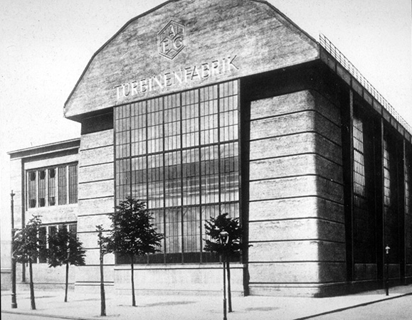
Analysis alone does not allow us to see the whole picture; instead, symphony creates more of an understanding.

Empathy
Use empathy instead of logic. It will create more meaning relationships.

Play
It is very important not to take everything very seriously, playing is an important part of the human experience.

Meaning
The meaning of life and design are more important than collecting artifacts.

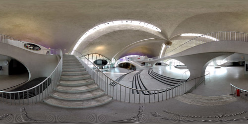
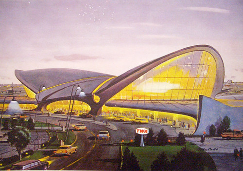
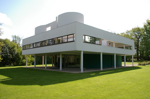
In his book, Daniel Pink recommends to have a holistic relationship with design. In order to accomplish this task, one must experience the environment by visiting, reviewing, looking, watching, and thinking about design.

The three design journals I would recommend are:

  • Architectural Digest: It provides many useful information for the design professionals as well as the general public.
  • Design Intelligence: Is a newsletter dealing with the business and strategic aspects for the design professional.
  • Web-Architecture: It is a web-based publication for architects, students, and other design professionals. The web access makes it convenient for professionals in the field to gather information faster.

Lastly, it is important to have a holistic approach to design and incorporate information from other sources in order to be more successful.

Sources:
A Whole New Mind, Daniel Pink, pages 65-99.